


Design Patterns: “Cards” in SeedCode Complete

· 3,683 views
SeedCode Complete 13
Our newest version of SeedCode Complete has been out for about 3 months and we’ve now had an opportunity to see how people are using and modifying it for themselves and their customers. Happily, one of our customers’ favorite design patterns is the one I’m personally the proudest of: we think of them as “Cards”. It’s essentially an updated take on the Selection Portal or Master Detail design patterns you may have seen. However, the new UI elements introduced in FileMaker 13 (Pop-Overs and Sliders), combined with the new Selector-Connector data model, really make Cards shine in Complete.
The Contact Card
In designing Complete We wanted to make the design patterns consistent throughout the entire solution. For example, when looking at a Contact–whether on the Contact layout or as a related contact on another layout–we wanted that presentation to be the same. The pattern we established in the main Contact layout would therefore be replicated throughout the solution so users could always recognize the interface for “Contacts”. Before FileMaker 13, this would be a challenge because there would typically not be enough real estate to show detailed Contact information in other contexts–on a Project layout, for example–without intruding on the Project information or seeming out of place. With 13, pop-overs and slide panels give us a lot more flexibility.
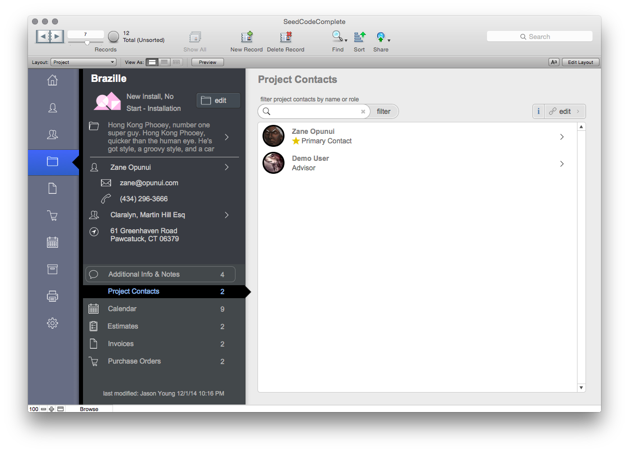
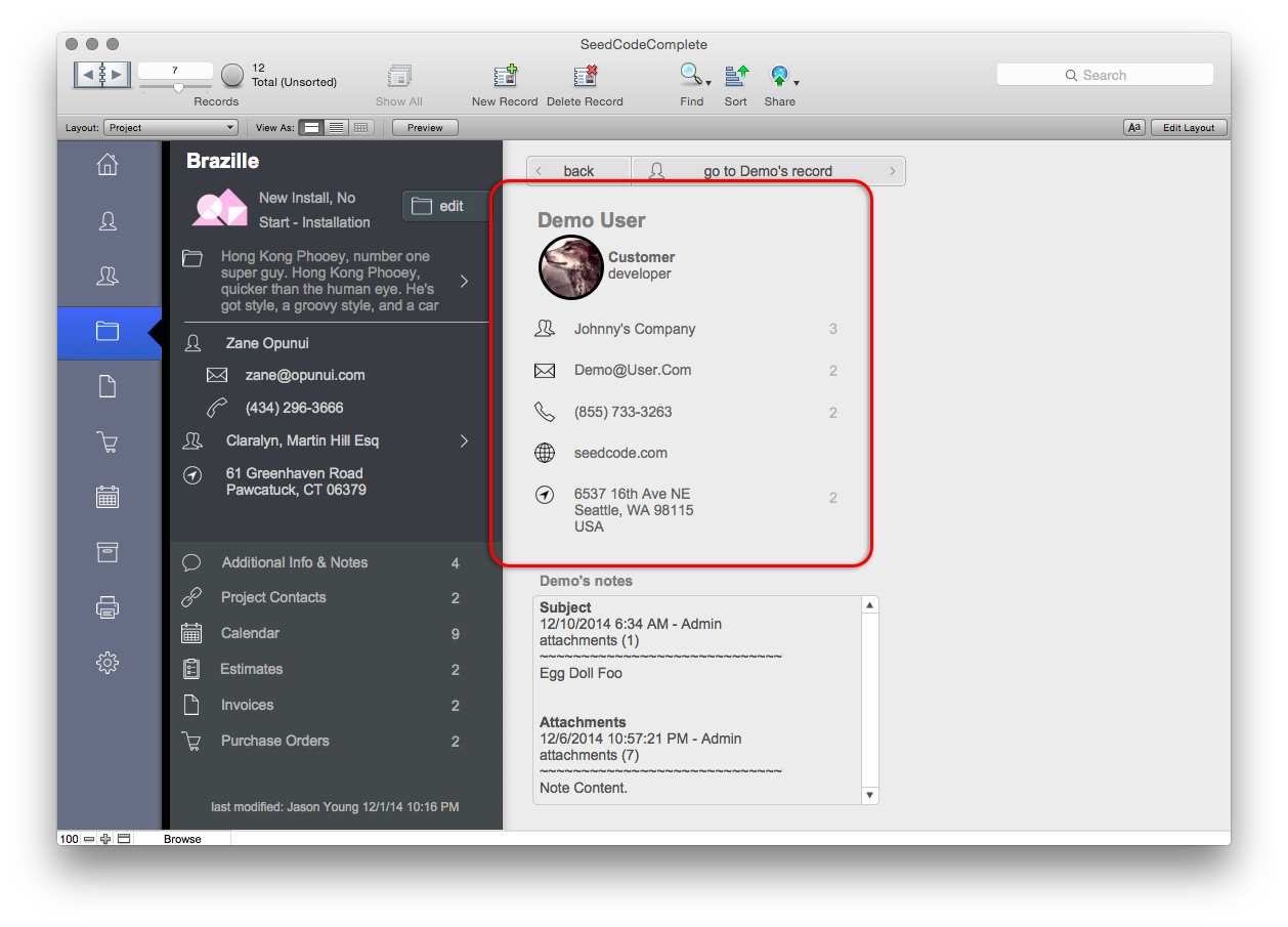
For the Contact layout we now display the basic information of the Contact with their thumbnail. We then use pop-overs as an easy to drill down to more information like additional e-mails, etc. Since we use a modal edit mode, all these fields are clickable, resulting in the appropriate action, e.g. open address in Google Maps in browser, open e-mail with selected address, etc.

Contact Layout.
This upper left section of the Contact layout, shown in red above, now becomes the “Contact Card.” When looking at related contacts, our original thought would be to access these Cards with Pop-Overs, however, we wanted the additional e-mails, etc. to be included and you can’t put a pop-over in another pop-over! After some experimenting we came up with the pattern of “sliding” to the card using a slide panel. This actually turned out better than the pop-over, particularly on OSX and iOS where we have animation making this feel like a modern mobile app. You click on the portal, and the whole portal slides to reveal the detail of the clicked row, very much like clicking on a Contact in iOS.
Contact Portal In Projects
Clicking on the portal row slides the portal to reveal the “Card”
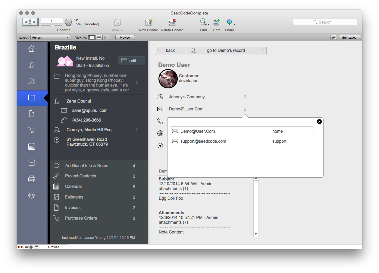
Pop-Overs showing related info in Cards
So now the user can “slide” to a Project Contact, access a summary of their information, send them an e-mail, or look up their address. If more Contact information is needed, or an edit needs to be made, then one more click takes you to the actual Contact record. It really smooths out the users’ navigation experience to have the Card as an intermediary between the current layout and the related records anchor layout.
The Selector-Connector Pattern
As pleased as we are about the Card design, we’re even more pleased about the way it was implemented. By using the Selector-Connector model, the Cards are all in the same context, so we can literally paste them from layout to layout and not have to change their fields to work in the new context. When we slide to a card, all we need to do is to set the Global Contact ID in the Selector table occurrence. If our “Card’s” fields all reference the SelectedContact table occurrence then they will work from any of our anchor layouts! This means when our customers need to add a Contact Card to a layout, they can copy it from any other instance of the card, and if the new layout is set up with the Selector-Connector pattern, they can paste the Card layout objects in without modification.
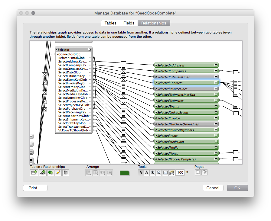
The Selector and SelectedContact Table Occurrences in Complete
For more on the Selector-Connector model check out our original article as well as this post from our friend and colleague Todd Geist.
Best of Both Worlds
It can be challenging to build something that gives the user a great experience, while making that same pattern easy for developers to carry into their own additions to SeedCode Complete. We love this Card pattern and probably would have implemented it even without Selector-Connector, but being able to provide it AND make it easy to work with has been very gratifying!
The post Design Patterns: “Cards” in SeedCode Complete appeared first on SeedCode.
Recommended Comments