


Claris Studio: Dashboards

By uLearnIT
· 476 views
Dashboards are a way to visualise your data. This can be done with charts and summaries. In this article, we will dive into all the options provided by Claris Studio.
As with other Views, a Manager can add a Dashboard View to a Hub so that it can be accessed by Members. Managers can access the Dashboard View directly for editing or view a Hub for standard use.
Create Dashboard
A Dashboard is one of the Views provided by Claris Studio. Unlike other Views, it is not created directly — create a Dashboard from a Spreadsheet View. This can be done from the Create Dashboard button in the toolbar or from the Chart by command in a column menu.
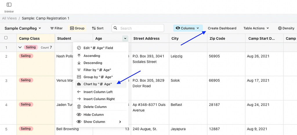 Create Dashboard or Chart by column
The Create Dashboard button opens a dialog to create a bar, line, pie, bubble or combo chart. You can select a column for the X-axis and there may be options for what to chart on the Y-axis (depending on chart type).

The Create Dashboard button opens a dialog to create a bar, line or pie chart. You can select a column for the X-axis and there may be options for what to chart on the Y-axis.
Dashboard Tools
The top white bar contains three buttons:
- Go To — direct access to Views with Same Data — click to go to a view
- Add Object — add objects to the Dashboard — Dashboard objects and Static objects (see below)
- Preview — preview how the Dashboard will appear when viewed through a Hub (not editable)
The grey bar below the header has four buttons:
- All Views (four square icon) — return to all Views listing
- View Name — click to edit
- Page Settings (cog wheel icon) — select theme colour (sets the header)
- Delete Page (meatballs icon) — delete the View; cannot be undone, removes the View from all Hubs
Add Object
An Object can be added to a Dashboard in a couple of ways:
- Add Object — use the pop-up Object menu to select an object. It will be added at the end of the Dashboard but can be dragged to reposition it.
- In Position — hover the mouse to the left or right or above or below an existing object to reveal a green line with a + icon. Click anywhere on the line to open the Add Object pop up menu and select a new object to go in that position. There is a limitation of three (3) objects per row — the line between or beside objects in a row of three will be orange.
To move an object to another position, hover the mouse over the object until a four headed arrow icon is displayed, then drag to reposition. A green line will be displayed to reposition on a new row, and a green box to position on the same row as existing objects.
Dashboard Objects
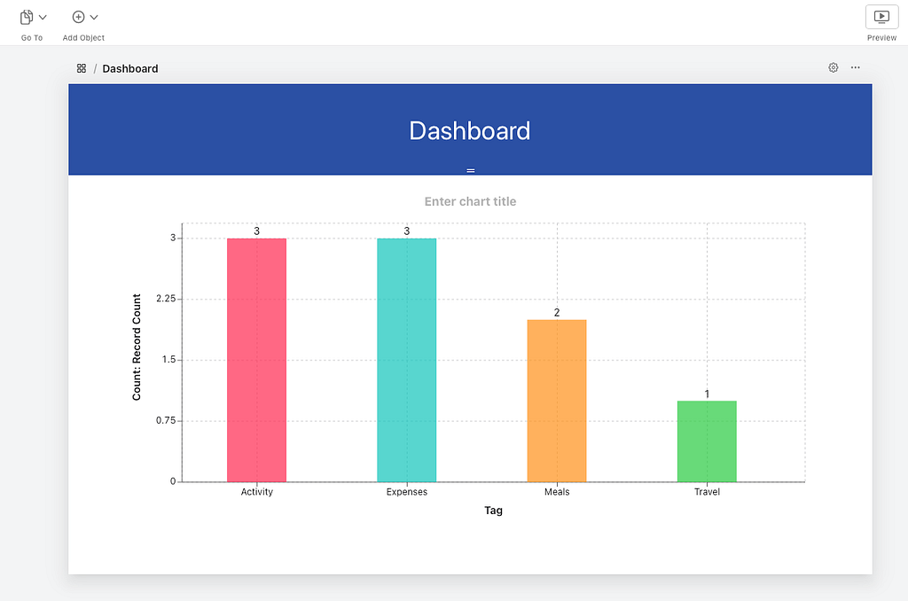
Chart Objects
Chart objects are Dashboard objects that can be added to a Dashboard. Every Dashboard will start with a chart object but it can be edited or deleted.

The Chart Title can be edited directly. There are no formatting options.
When working with the Chart Object, there are two buttons at the top right:
- Chart Settings (cog wheel icon)
- Delete (meatballs in circle icon) — delete the chart object
There are three Options for charts — Type, Table and Filter.
Currently, there are five (5) available chart types:
- Bar — best for grouped sets of data
- Line — best for continuous data, most commonly with dates on the X axis
- Pie — best for grouped data to show relative proportions
- Bubble — best for grouped data, charted by two values — one for Y axis, the other for bubble size
- Combo — combines multiple data series charted as bar or line
Each of the chart types deserves some investigation of the options available.
Selecting a Table for the Chart allows the manager to select any table from the Claris Studio instance. This means that a Dashboard can display a combination of objects drawing data from several tables. Could be very useful.
The Table selected for the Chart can be filtered by adding a Condition as is done in the Spreadsheet View. There can be multiple conditions, each with multiple sub-conditions.
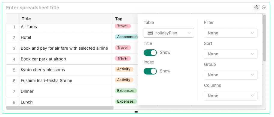
Spreadsheet Object
Spreadsheet objects provide an embedded Spreadsheet in a Dashboard. The Spreadsheet title can be edited directly. The Manager creating the Dashboard can reorder and resize the columns but they are fixed in the Dashboard View via a Hub.
There is a fixed Index (row number) column at the left. All columns in the selected Table are initially displayed across the object, which can be scrolled left–right and up-down. The Spreadsheet object can be resized vertically to show more or less columns.
When working with the Spreadsheet Object, there are two buttons at the top right:
- Spreadsheet Settings (cog wheel icon)
- Delete (meatballs in circle icon) — delete the spreadsheet object
As for Chart objects, the Manager can select any Table from the Claris Studio instance. The Spreadsheet Title and Index column have options to hide or show.
The Manager can apply Filter conditions, Sort order rules, Grouping rules, and select and reorder Columns. None of these are editable when the View is accessed through a Hub. Likewise, spreadsheet data is editable by the Manager directly in the View but not via a Hub.
Just a thought: Providing a Spreadsheet object in a Dashboard View may be a better option for some use cases than providing a Spreadsheet View.
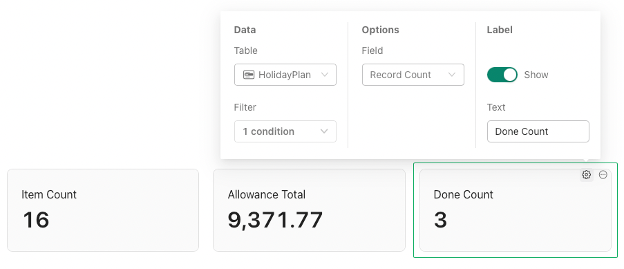
Summary Object
Summary objects provide a record count for a selected table, or a summary of a single field in a selected table.
When working with the Summary Object, there are two buttons at the top right:
- Summary Settings (cog wheel icon)
- Delete (meatballs in circle icon) — delete the summary object
As for Chart objects, the Manager can select any Table from the Claris Studio instance. Filter conditions can be applied.
The Options available are either Record Count or to select a column from the Table. The Summary object Label can be show or hidden, and custom text entered. There are no formatting options.
Filter Object
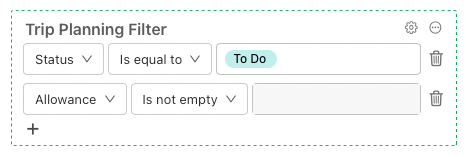
Filter objects provide a tool for a Dashboard user (via a Hub) to apply filters to one or more Dashboard objects. A Filter object controls data for a single selected Table and is connected to one or more selected objects for that Table.
When working with the Filter Object, there are two buttons at the top right:
- Filter Settings (cog wheel icon)
- Delete (meatballs in circle icon) — delete the filter object
As for Chart objects, the Manager can select any Table from the Claris Studio instance. Any Dashboard object for that Table can be connected. In the example below, the filter has been applied to all Summary objects. If an object is connected to a Filter, a dashboard filter icon is show at the top right of that object.
Multiple filters can be created in a Filter object selecting a column, operator and optional data. Any filter created can be deleted (Trash can icon).

It would be best practice to position the Filter in the Dashboard directly above the objects to which it is connected. It is possible to provide multiple Filter objects applied to different sets of Dashboard objects.
Interestingly, multiple Filter objects can be connected to the same Dashboard objects. Their effect is additive. Likely not best practice!
When a Filter object is displayed in a Dashboard View via a Hub, the user cannot edit the column for any filter or delete filters. They can edit the operator and the optional data. The Refresh button at the top right resets the filter to the default values set by the Manager when creating the Filter object.
 Filter object seen through a View in a Hub
Quick Filter Object
Quick Filter objects provide a tool for a Dashboard user (via a Hub) to apply pre-configured named filters to one or more Dashboard objects. A Quick Filter object controls data for a single selected Table and one or more selected Dashboard objects for that Table.
When working with the Quick Filter Object, there are two buttons at the top right:
- Quick Filter Settings (cog wheel icon)
- Delete (meatballs in circle icon) — delete the quick filter object
Selecting a Table and connected Objects works as for Filter objects.
Multiple quick filters can be created in a Filter object selecting a column, operator and optional data. Any filter created can be deleted (Trash can icon). Each Quick Filter can be named and appears as a button with that name.
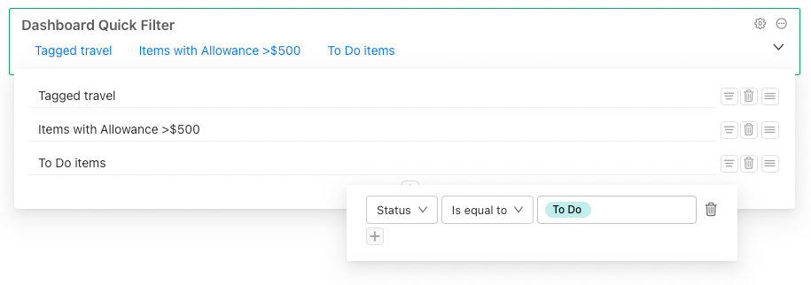
When a Quick Filter object is displayed in a Dashboard View via a Hub, the user cannot edit any quick filter provided. They simply click any button to apply the named filter. There is no access to see the Filters applied so it is good practice to explicitly name each quick filter. Only one quick filter can be applied at any time. Click again to remove the quick filter.
 Quick Filter applied in Dashboard via Hub
Static Objects
Currently there are three (3) Static object types:
- Text Block
- Image
- Header
A Text Block object is used to add static text such as a heading or explanatory notes to a Dashboard. Text Blocks support Markdown for text formatting. The Text object will resize vertically to accommodate all text entered.
An Image object is used to add an image such as a logo or other graphic to a Dashboard. Vertical and horizontal alignment within the object can be applied. The image can be set to Contain (sized within the object) or Fill. The Image object can be resized vertically.
The Header is a static object that can be edited, formatted or removed.

The colour can be set with a limited palette using the Page Settings Theme Colour.
The initial text displayed is Large Text (see below). The text can be edited directly. When text is selected, a formatting toolbar appears above.
The buttons 1, 2 and 3 control the heading size. The heading size applies to the entire text. The selected size is shown as a green button. If no button is selected, the text is “body” (small) size.
The B, I and S buttons are for bold, italic and strikethru respectively. These apply to the selected text so it is possible to have a combination of words in bold and others in italics.
The header size can be adjusted by dragging the two line icon at the bottom centre of the header.
When working with the Header, there are two buttons at the lower right:
- Header Settings (cog wheel icon)
- Delete (meatballs in circle icon) — delete the header object
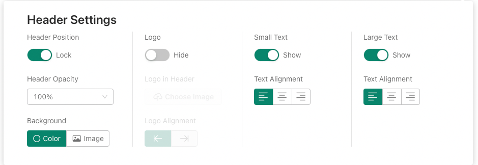
There are various Header settings:
- Header Position — lock or unlock — if locked, the header will remain at the top of the screen while the user scrolls down, objects scroll behind; if unlocked, the header scrolls off the screen.
- Header Opacity — set to either 100% or 80%
- Background — set the either Theme Colour or an Image (stretches to fill)
- Logo — hide or show
- Logo in Header — if shown, Choose Image or Replace Image
- Logo Alignment — if shown, logo can be left or right in Header (logo can be resized in the Header but has a limited width)
- Small Text — show or hide, appears above Large Text; same formatting options as for Large Text but size selection is 4, 5, 6. Text alignment left, centre, right.
- Large Text — show or hide, appears below Small Text. Text alignment left, centre, right.
The Text alignment setting affects both Large and Small Text — they cannot be set independently. This may be a bug. Small Text and Large Text allow only one line of text for each.
Conclusion
Dashboard views provide a useful view to summarise the data in one or more tables. They can be used to provide instant and up to date visualisations of data.
Claris Studio: Dashboards was originally published in Discover the Claris platform on Medium, where people are continuing the conversation by highlighting and responding to this story.
Recommended Comments