


Claris Studio: Kanban View

By uLearnIT
· 512 views
Kanban is a View that uses columns to categorise tasks. This is most commonly used to track progress of tasks in a project. In this article we will look at the features and benefits of Claris Studio Kanban Views.
What is Kanban?
Kanban is a Japanese word meaning “visual sign”. It originated as a scheduling system at Toyota to help with “just in time” (or Lean) manufacturing.
At the beginning of 2007, the Kanban Method became popular in areas like Research and Development, and software development.
Some people pronounce the word “can-ban” and others say “carn-barn”.
To manage a project, imagine a simple Kanban Board with three columns — To Do, In Progress and Done. Each column is a step in the workflow. Every task is entered on a separate Kanban card and placed in a column. Each task will start in the To Do column, move to In Progress and finish in Done. This is a visual way of tracking the scope of work required and how close the project is to completion.
One of the principles of Kanban is to limit work in progress (WIP). The Kanban board allows you to track the number of cards in that column and therefore limit the number according to capacity.

Create Kanban View
There are two ways to create a Kanban View:
- using the Create New View button when looking at all Views
- from an existing Spreadsheet View or Form View
Create New View
When using the Create New View button, Kanban is one of the choices. This will create a brand new Table for the data underlying the Kanban View. You do not have an option to select an existing Table.
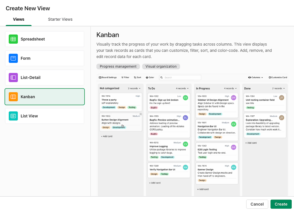
The Kanban View created will be given a generic name such as Kanban 1. This can be edited directly in the toolbar. There are four columns — Not categorised, To Do, In Progress and Done. There are no cards.
The Kanban View created is the only View of the new Table. You can then create a Spreadsheet View from the Kanban View to aid in managing the data.
Create From Existing
If you have an existing Spreadsheet View or Form View for a Table, you can create a Kanban View for that Table.
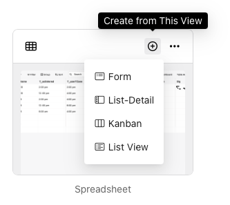
Interestingly (or confusingly), you are able to select any Spreadsheet View from the Claris Studio instance as the Data Source for the new Kanban. The View used is automatically selected.
Kanban Columns must be based on a Single Choice field. If one or more of these fields exist in the Table, you can select the desired field. If none exist, or if you need, you can create a new Single Choice field on the fly.
Using Kanban View
Once you have created a Kanban View, it can be used to manage tasks.
The top bar in Kanban View contains the Sidebar button — used to open the sidebar with access to Views with the Same Data and Fields (from the current table).
The second (grey) bar contains the breadcrumb for navigation. The first button (four squares) goes back to All Views. The next is the name of the current View (in this case, Construction Kanban) — click to edit.
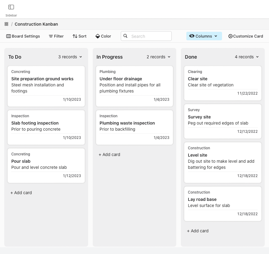
Tool Bar
The third bar down contains the majority of the tools for Kanban View. The high level view of each is listed here and we will go into more detail about each below.
- Board Settings
- Filter — add conditions to filter the list
- Sort — add a rule to sort rows
- Color — add a condition to mark rows with a
- Search — enter text to search all cards
- Columns — show, hide and reorder columns (choices from Single Choice field)
- Customize Card — fields to show on each card
Board Settings
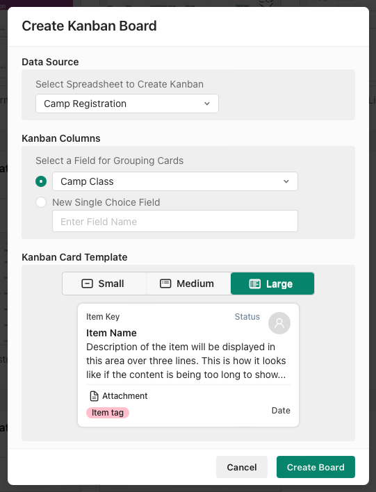
Board Settings brings up the same settings as for Create Kanban Board (see above) but it is named Update Kanban Board. Although present, the Data Source (Spreadsheet View) cannot be changed. You can change the Single Choice field for defining columns, and the Kanban Card template (small, medium or large). Click Save to save changes.
Filter
You can reduce the number of cards displayed by applying filters. On first open, you see that the Records are not filtered with a button to Add Condition.
For a Condition, select a column, a comparison operator and (usually) specify an option.
The comparison operators are (depending on the field type):
- Is equal to, Is not equal to
- Is empty, Is not empty
- For text — Contains, Does not contain
- For numbers — Is greater than, Is greater than or equal to, Is less than, Is less than or equal to
- For dates and times — Is before, Is on or before, Is after, Is on or after, Is in the future, Is in the past
Further points to note:
- Can create multiple conditions.
- Choose if cards are displayed if all (logical AND) or any (logical OR) of the conditions are met.
- Choose to Keep Filtered — the filtered set will update as you add and edit row data, or turn off to not Filter but keep the conditions.
- Delete any condition (Trashcan icon), or Clear All.
- When Filter conditions are applied, the Filter button is highlighted.
- A column does not need to be displayed in the Spreadsheet View to be used in a Filter condition.
Sort
You can sort the cards displayed in each column by applying rules. On first open, you see that the Records are not sorted with a button to Add Rule.
For a Rule, select a field and a sort order.
The sort orders are as for Grouping:
- Drop-down, Checkboxes, Single Choice — First-Last / Last-First (by list order)
- Other fields — Ascending / Descending
Further points to note:
- Can create multiple rules — can be re-ordered for sort levels e.g. sort by Tag then Title
- Choose Keep Sorted to apply the rules continuously — when rules are applied, the Sort button and relevant columns are highlighted.
- If Keep Sorted is off, you retain the rules and can use the Sort Now button for a temporary sort.
- Delete any rule (Trashcan icon).
- A column does not need to be displayed to be used in a Sort Rule.
Color
You can mark cards that match a condition with a color swatch in the row number header. On first open, you see that there is No record color specified with a button to Add Condition.
For a Condition, select a column, a comparison operator and (usually) specify an option.
The comparison operators are (depending on the field type):
- Is equal to, Is not equal to
- Is empty, Is not empty
- For text — Contains, Does not contain
- For numbers — Is greater than, Is greater than or equal to, Is less than, Is less than or equal to
- For dates and times — Is before, Is on or before, Is after, Is on or after, Is in the future, Is in the past
Further points to note:
- Can create multiple conditions — can be re-ordered and deleted
- Each condition can contain multiple sub-conditions — can be set to show color if All or Any of the conditions are met
- If two conditions are true for a card, the first one wins and that color is displayed
- Can choose a color for each condition (two conditions can have the same color)
- Delete any condition or sub-condition (Trashcan icon)
- A column does not need to be displayed to be used in a Condition.
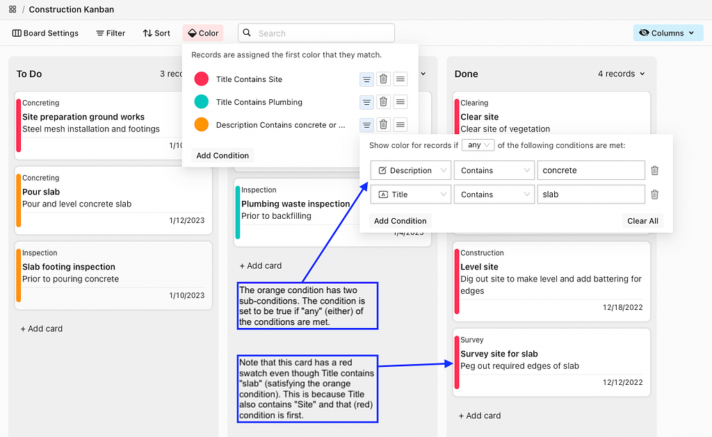 Multiple color conditions applied
Search
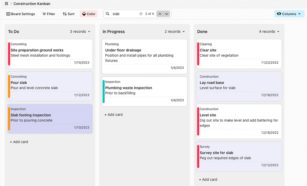
The Search box allows for a ‘card content contains’ search of all visible data.
When the search is applied, cards containing the string will be highlighted. The number of found cards is shown in the search bar e.g. 1 of 4. There are chevron icons to jump between the cards containing the found instances. Use the x button to clear the search.
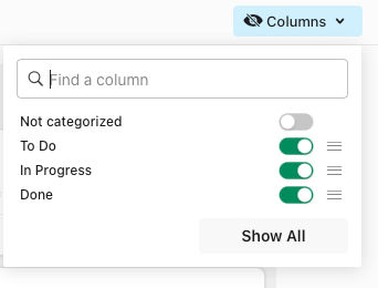
Columns
Toggle the control to show and hide columns in Kanban View. Columns are the choices defined for the Single Choice field selected. The Columns option also allows you to easily reorder the columns across the screen by dragging the reorder icon (three lines) up or down.
There is a button to Show All (if any columns are hidden) or Hide All (if all columns are shown).
Tip: If you want to show most of the columns, Show All then turn off the columns you want to hide; if you want to hide most of the columns, Hide All then turn on the columns you want to show.
If you have a lot of choices, there is a Find a column search tool to reduce the list. This works on a ‘choice contains’ rule e.g. a search for n will return the Not categorized, In Progress and Done choices.
Customize Card
This allows Field Mapping for the components of each card. A card may display the following components:
- Key — for small, medium, large cards
- Status — small, medium, large
- Title — small, medium, large
- Assignee — small, medium, large
- Date — medium, large
- References — medium, large
- Description — large
- Attachment — large
The Field Mapping list will display the components available for the Kanban Card Template selected in Board Settings as shown in the list above. There is no option to customise the display of components on cards — the position and font for each is determined by the Kanban Card Template.
Each of these components can be mapped to a field in the underlying Table. The field name does not have to match the component name — select whichever field contains the required data for each component.
Each component has the option to Show or Hide. If Hide is selected, the component will not display on the card.
 Customize Card — field mapping for medium card
Working with Records
The majority of the Kanban View displays columns containing cards (one for each record).
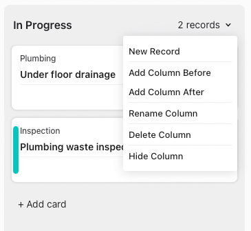
Each column has a header displaying the value from the Single Choice field, the number of cards (records) for each choice, and a downward chevron menu.
The column name can be edited directly. Note that this will change the field choice defined for the field and also update the field in each record that uses that choice.

The column header menu can be accessed using the downward chevron icon or by right-clicking in the header. The commands available are each fairly straightforward:
- New Record — creates a new card in the column auto-entering choice (as for + Add card button)
- Add Column Before/After — creates a new choice for field, placing column before or after the current column
- Rename Column — edits the choice as per directly editing the column heading
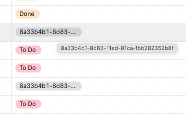
- Delete Column — deletes the choice from the Single Choice field (see bug below)
- Hide Column — hides the columns as per the Columns toolbar function
 Column header menu
As of writing, there is a bug with the Delete Column function. One would expect that any records with the deleted column would be empty for that field. Instead, they contain an artifact of the former available choice (a UUID of some sort). This can easily be deleted or changed to an existing choice when in Spreadsheet View.
Editing Records
When hovering the mouse over a card, there is a small meatballs icon in the top right corner. Clicking this icon reveals a record editing menu.
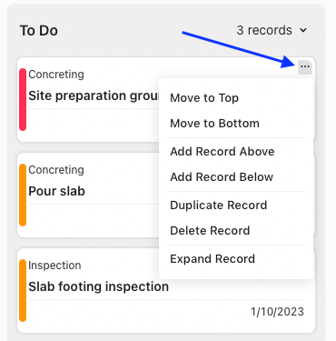
The commands available are each fairly straightforward:
- Move to Top/Bottom — move the card to the top or bottom of the column
- Add Record Above/Below — creates a new record above or below the current record in a column
- Duplicate Record — creates a copy of the current record and places it below the current record
- Delete Record — deletes the record from the Table
- Expand Record — opens an Edit Record window form to edit all fields in the record
Note also that:
- cards can be manually dragged up and down in a column
- cards can also be dragged between columns thereby editing the Single Choice field
- click a card to quickly Expand Record for editing
- the Edit Record window has a button to + Add New Field
- when using Add Record Above/Below or + Add card, the Edit Record window opens automatically to allow you to fill out the record. There is no Delete function provided if this is done in error — the user must close the window and then delete the empty record.
Conclusion
For a first iteration, this is a simple Kanban view of data. It is a useful and workable view for visualising tasks and updating their status. There are feature requests such as a WIP limit (restricting the number of cards in a column) and swimlanes (for separation of tasks in a column). Hopefully the Kanban View will be iterated in future.
Claris Studio: Kanban View was originally published in Discover the Claris platform on Medium, where people are continuing the conversation by highlighting and responding to this story.
Recommended Comments