


Claris Studio: Edit Web Forms

By uLearnIT
· 658 views
In our last article, Claris Studio: Create And Share Web Forms, we looked at the basics of creating a web form and sharing it with the public via a web URL. Now we move on to editing the Form provided, looking at the tools and features of Claris Studio Forms.
Just a reminder that Claris Studio is rapidly evolving, but we will try to keep this article updated as tools and features change.
Creating a Form
If you Create New View in Claris Studio, it creates a new table and two views — a Form and a Spreadsheet. You will not always want to create a new table for a new Form — often, you will want a new Form for an existing table.
Create a new Form for an existing table with Create from This View using an existing Spreadsheet View. This option for a new Form is not available from any other View type.
 Create from This View — Spreadsheet
When we create a new Form in this way, Claris Studio still creates a two page registration form. However, the first page is populated with all the fields from the existing table.
With any Form, the first thing you need to do is to give it a meaningful name. The default name provided by Claris Studio is shown in the breadcrumb at the top left and can be changed there — just click and type.
 Change Form name in breadcrumb navigstion
Holiday Planning Example
The example we will use here is one where we are setting up views for our holiday planning. The Form allows our whole family to suggest things for planning our holiday and categorising them as travel, accommodation, activities or expenses. They can assign a budget to an item as needed.
The Form will provide us easy access to add a new record when it occurs to anyone. This will be convenient as we will not have to sign in or use an app — just have an Internet connection and our phone.
Our Form will provide simple and quick data entry, with options for more details. It is a very good idea to have a plan of your new Form in your head or preferably on paper.
Edit Page
When we have the Form View open, we see the page flow (in this case two pages). We can easily rename each page, and add a new page in the flow.
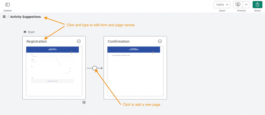 Edit Form and Page names, and add new page
Once you have set up the pages you need for your Form, it is easy to edit the first page — hover over the page to see Edit Page, and click.
 Edit Page
Page Settings
The cogwheel icon at the top right of the page being edited is for Page Settings. The settings are quite basic — Theme Colour and Required Field Objects.
There are four theme colour choices. This will affect the colour of the header and the buttons at the bottom of the page.
There is a checkbox to instantly set all field objects on the page to required (not empty). This saves you having to individually set each field. If most of the fields on the page were required, you could turn on all required and then turn off the optional fields.
The three horizontal dots (meatballs) icon provides either Delete Page (if the Form has three or more pages) or Delete Workflow (for two pages, deletes the entire View).
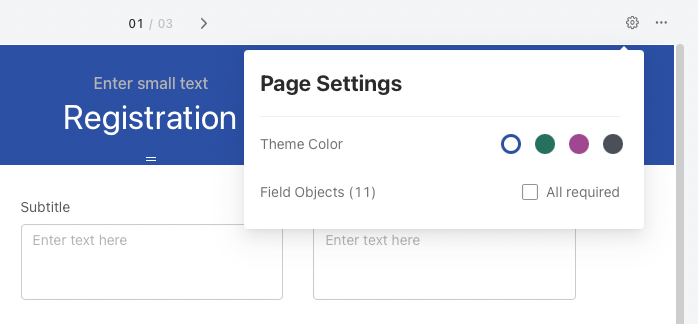 Page Settings
Field Objects
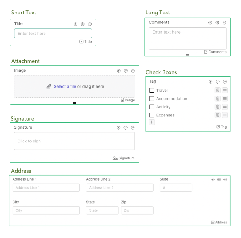
A page holds objects. Objects are either Field Objects or Static Objects.
New objects can be added from the Add Object widget at the top of the screen. Simply drag an object from the widget onto the page and the widget will close. There is an option to “pin” the widget to Keep list open in a movable floating window.
If you position the mouse beside or between objects or rows, a green line with a + symbol also allows you to add objects in the clicked location. This is only available if the Add Object widget is not pinned open.
Adding a Field Object from the widget will create a new field in your table. You can drag existing fields onto a page from the Sidebar > Fields list. Note that some fields will be greyed out because they already exist on one page of the Form. Currently, the limitation is that any one Field can only exist once across all pages of a Form.
 Add Objects with the widget and manually between objects/rows
To start, all the field objects are arranged down the page, one per row. Fields can be dragged around on the page. They will rearrange and resize according to where they are placed. You can place up to three objects (Field or Static) per row.
There is currently no way to custom-set the width of an object — it will either be full, half or one-third column width. There are no spacer objects but you can use an empty Text Block to force the resize of an object on a row (see below, the Budget field is between two empty text blocks).
 Reposition and resize objects on page
When you hover over or select an object, it will display various controls and tools. The number and nature of these will depend on the object itself.
 Selection of Field Object types
Most of the controls are annotated in the screenshot below:
 Field controls
- Label — the field label shown in the form to explain the data required (initially the same as field name, edit in place)
- Placeholder text — text displayed in an empty field to further explain what should be entered (edit in place)
- Vertical resize — available for some field objects (Long Text and Attachment) to drag to adjust vertical size of field
- Lightning (icon) — Action Engine to set conditions for hiding or showing field object
- Cogwheel (icon) — field options depending on field object type — Required status (all fields), list control (Drop-down), signature area and pen colour (Signature), date and time format (Date, Time and Timestamp), decimal format and currency symbol (Currency)
- Meatballs (icon) — Delete field from the page (not from the table)
- Field type icon — signifies the field object type in an icon (as per Add Object widget list)
- Field name — name in the table
- Options for Checkboxes and Single Choice fields — add, edit (direct), delete, reorder (drag)
The Action Engine (lightning icon) needs a little more explanation. This is used to conditionally show or hide a Field Object. It can also be used for static image and text objects (updated 18 Jan 23).
 Field Object Action Engine — conditional hide or show
In the above example, we have determined that when the Tag field is Physical Activity, the Budget field will be hidden. Our logic is that physical activity (going for a hike or a swim) will never cost us anything so we don’t need a budget. We will now Save the condition.
We can add multiple conditions to the same action using + And When, and also Save multiple actions. All saved Actions are managed in the Manage area — each Action can be disabled or deleted.
This powerful feature allows you to create smarter forms where fields appear or disappear depending on responses in other fields.
As of the 15 Dec 22 update, when you conditionally hide a field object in Form and List-Detail views, objects beside and below adjust to fill the space.
Also note that if a field is set to Required, and it is hidden by an Action condition, the user will not be required to fill it in. Makes sense but the Claris engineers did think of that scenario.
Static Objects
There are three static objects available — Text Block, Image and Header.
Static Text Blocks are added to a page to provide more information or messages to the user. As with field objects, they can be dragged around and will resize when placed next to other objects in a row.
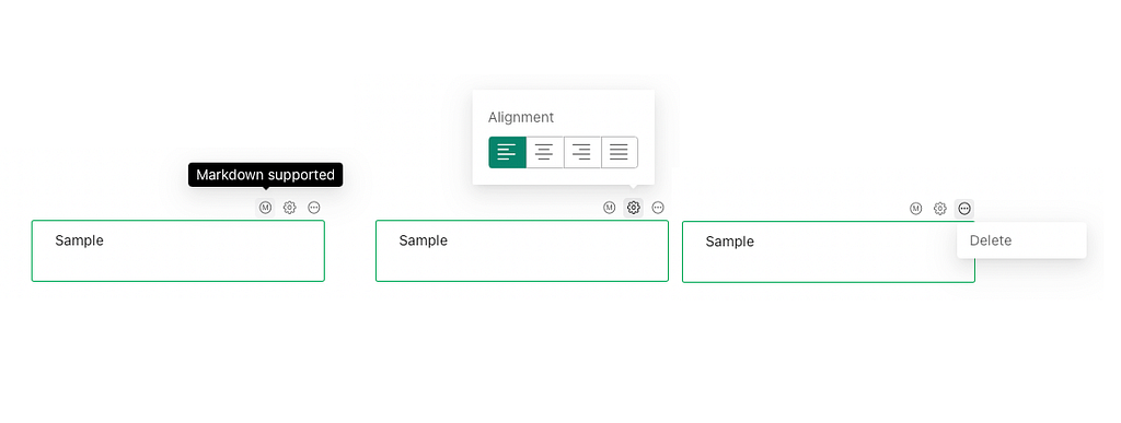
Click on a Text Block to display options with three icons:
 Text Block options
- M — informational — Markdown supported in Text Blocks for formatting
- Cogwheel — text alignment
- Meatballs — Delete from page
Markdown is a lightweight markup language that you can use to add formatting elements to plain text documents. Simply type text in the Text Block and use Markdown symbols to format. For example:
- # Heading level 1
- ## Heading level 2
- You can have **bold** text or *italicised* text or ***bold and italic***
- > Create a block quote
- >> And a nested block quote
- * bulleted list item
- *** for a horizontal rule
There is good support for Markdown. Have a play and see what works.
Static images can be added to a page for information or design. This is different to providing an attachment field for a user to upload an image.
- Add an Image Object from the widget, or
- Drag an image file directly onto the page.
 Static Image options
The cogwheel icon provides options for vertical and horizontal Alignment of the image in the object and whether it Contains or Fills the object. The meatballs icon provides Delete. There is a vertical resize at the bottom to resize the object.
A page can have a Header — an area at the top of the page.
 Header Settings
Open the Header Settings (cogwheel icon):
- If the Header Position is Locked, the page will scroll behind it as it stays in place; if it is Unlocked the header will scroll off the top of the screen.
- The Header may have an Opacity of 100% (opaque) or 80% (slightly transparent).
- The Header Background can be a colour (set by the page theme) or an image.
- Two text sections — Small Text and Large Text — show or hide; adjust text size (Large = Heading 1, 2, or 3; Small = Heading 4, 5, or 6); set alignment.
Each page has an independent header. As of the 30 Nov 22 update, there is an option to set a master header for the Form — Repeat this header on all pages.
Page Buttons
All pages except the last have buttons at the bottom right. Button colour is controlled with the Page Setting Theme Colour. However, the text and position cannot currently be customised. The buttons are Next, Previous and Submit and are provided automatically as required.
The Next button will usually go to the next page in the workflow; the Submit button will usually go to the last page. However, you can control the workflow with Jump to Page options using an icon below the button (or below the page when looking at the entire View workflow).
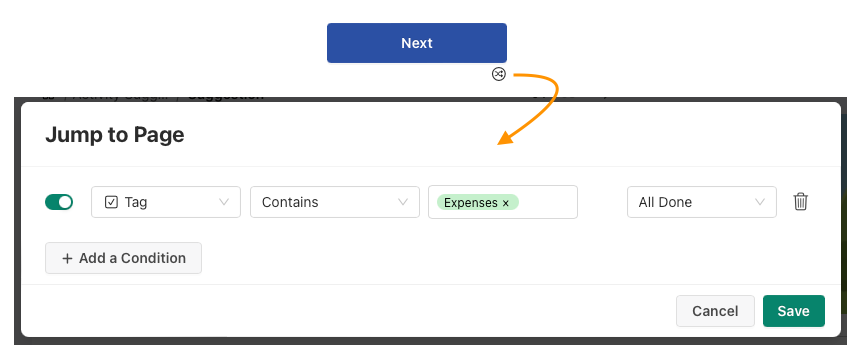 Button option Jump to Page
In the example above, we have set a condition that, when true, will jump to the All Done page (skipping one or more pages). If the condition is false, the button behaves as normal.
You can add multiple conditions. These are evaluated in order listed with the first one evaluated as true being run (subsequent conditions are ignored).
This feature allows you to design forms to skip certain pages based on the answers to questions. For example, if a user answers that they do not own a car, then skip the car insurance page.
The page workflow is strictly linear. Hopefully there will be branching in future.
Back to Our Example
Phew! That is a lot of features available to set up a web form. Claris Studio is a very young web app but it already has a lot of power just in the Form Views.
So about our example? We have used a lot of the features above to set up a three page form. Before we share it to a public URL, we should test it to see how it works on a Laptop (1024px), Tablet (768px) and Mobile (360px). Claris Studio provides an easy Preview option for this. You can also test in normal or dark mode (setting determined by the user).
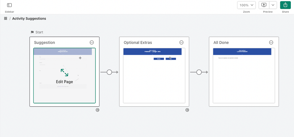
Here is our completed Form in workflow view:
 Three page workflow — Suggestion, Optional Extras, All Done
The web form created by Claris Studio is responsive — it will resize and reorganise depending on the available screen size. Here is the first page (Suggestion) in three different sizes:
 Laptop preview
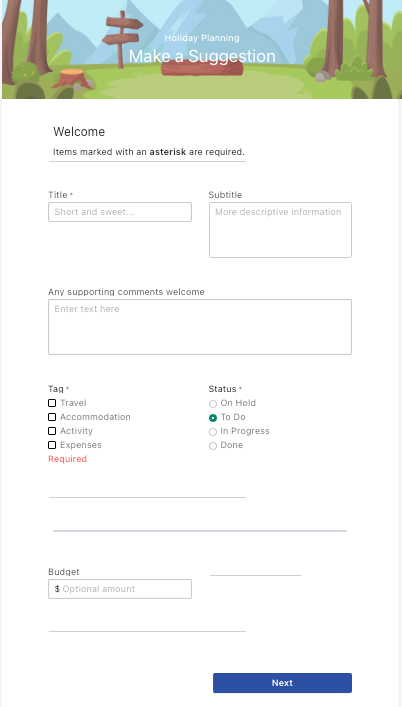 Tablet preview
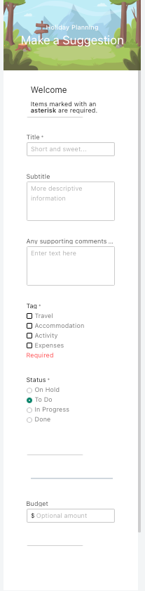 Mobile preview
These previews provide great feedback for changes needed to improve the experience on tablet and mobile.
When entering Preview, Claris Studio gives the following warning:
Data submitted while previewing a form is not saved.
To save submitted data, use the shared form.
This is great! It means that you can fully test the form and all the conditional logic you have built in to make sure it works the way you intended.
All that is left is to set up sharing as per our last article. And wait for the data to start rolling in from the family!
How easy and powerful is that?
Claris Studio: Edit Web Forms was originally published in Discover the Claris platform on Medium, where people are continuing the conversation by highlighting and responding to this story.
Recommended Comments